IDENTITY
Center for the Art of Translation
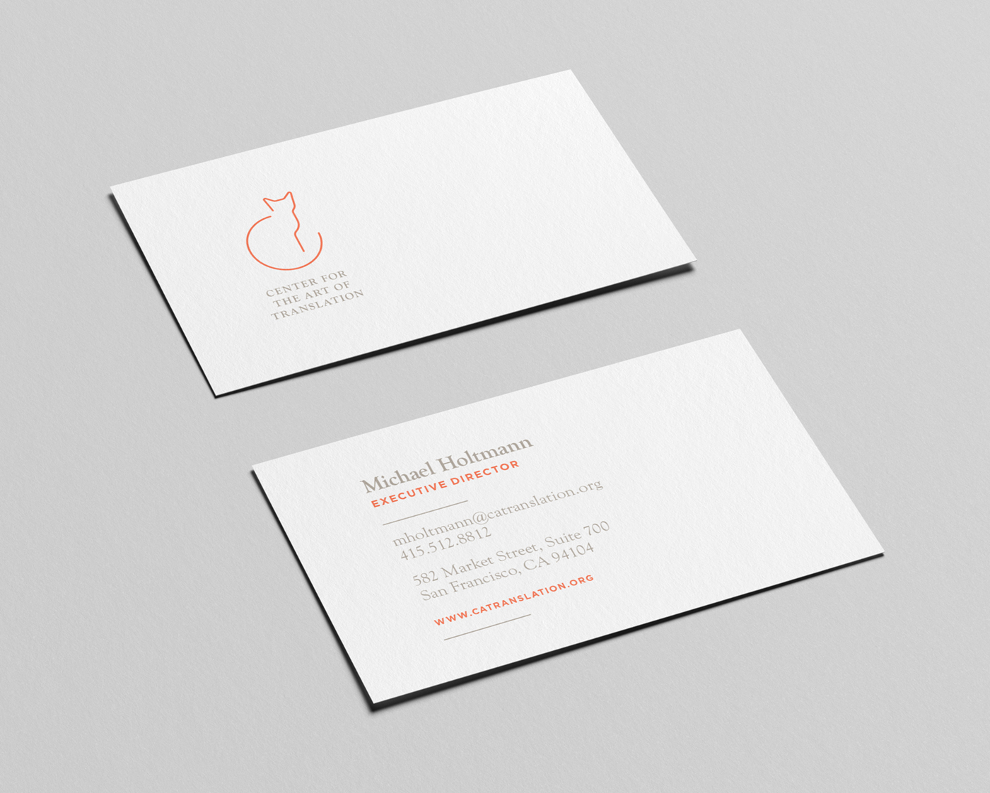
Bridging old and new, I redesigned the Center for the Art of Translation’s cat based logo with a cleaner more modern take that echos the “C” of “center”. The mark also still relates back to their affiliated press, called “Two Lines” (based on the line drawing of the original mark). Paired with an elegant wordmark, the brand also consists of a bright orange and warm grey color palette and comprehensive type system. In addition I also created custom print collateral and swag. Work completed at MacFadden and Thorpe.